In our most recent blog post, we discussed the level of importance behind logos. There are some who make too much of logos and those who don’t make enough about logos—both to their detriment. So if it does matter how the logo looks, are there any successful companies with ugly logos? More importantly, can your company be successful with an ugly logo? The short answer for both of these questions is yes. There are plenty of businesses that have had success with ugly logos. Here are just a couple of quick ones: Kirkland, Nestle, and Mozilla Firefox.
KIRKLAND: This is the Costco-related brand, not the home decor brand (which is Kirkland’s). The font for this brand is unattractive and doesn’t have much appeal at all. So how is it successful? That’s pretty easy. This is the “home” brand for Costco, which means that it’s success is already provided for through the main business. All Kirkland has to do (or Costco) is ensure the quality of the products are good. In this form, as Costco goes, so goes Kirkland.
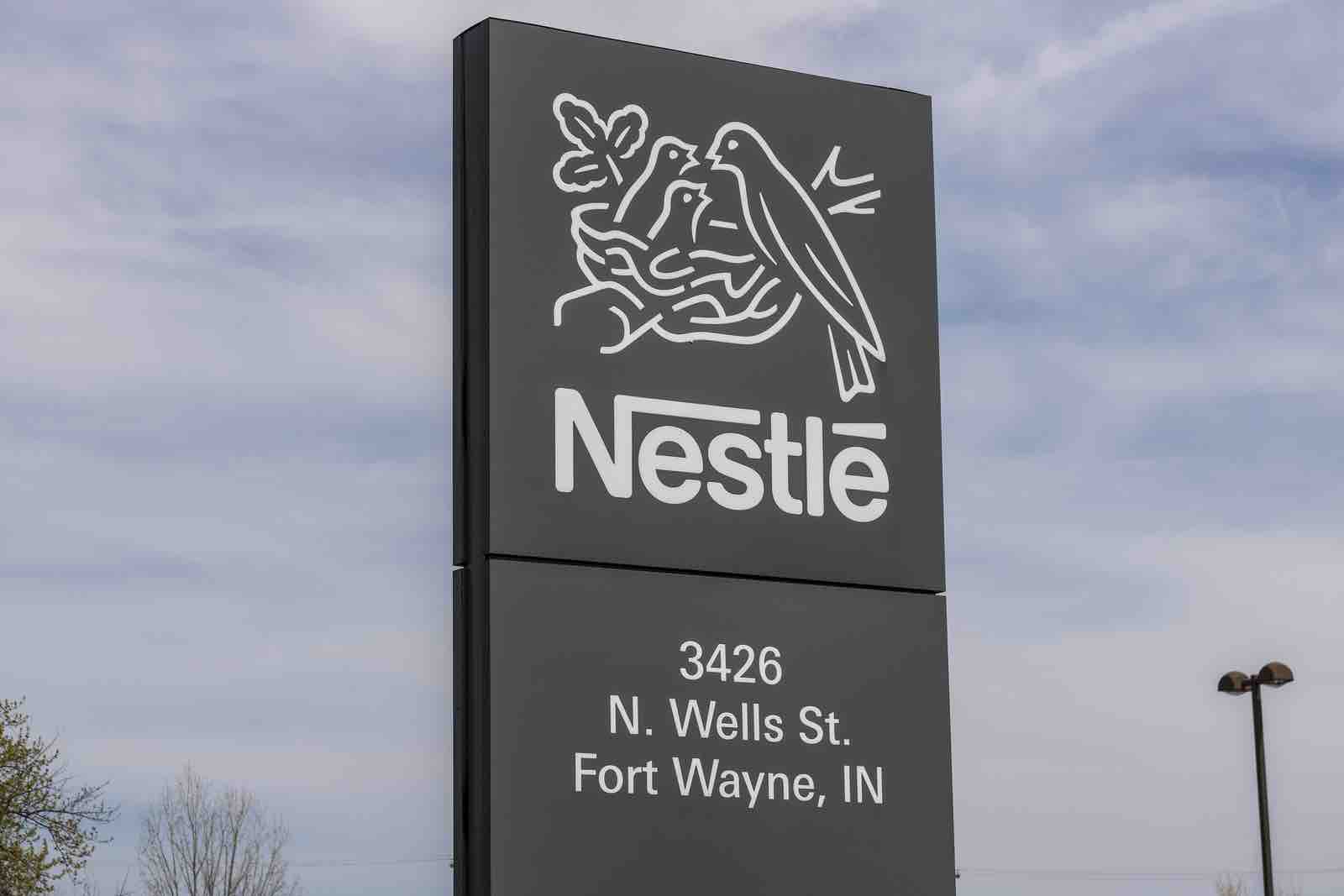
NESTLE: This logo is rather complex. But it doesn’t change the fact that it doesn’t represent what it is most known for: chocolate. Nor does it change the fact that it is not visually appealing. Nestle’s logo is birds in a nest (a mama bird and two baby birds), which is also the Nestle name crest. The company started around 1870 and provided lactaid for mothers who could not breastfeed. All in all, the logo makes sense according to that product line. In 1904, the company placed chocolate into its line of products. Over a hundred years later, this product is what it is most known for. The crest of birds still remains, but consumers most identify with the namesake, rather than the birds.
MOZILLA FIREFOX: This company is not nearly as old as Nestle, but it does have an animal in its logo. An animal makes sense for the namesake; but it doesn’t change the fact that it is too busy with the combination of the world and the fox. It is much better, however, than it’s original 2002 version (we have no idea what is going on there). We understand that it’s for the WorldWide Web, but adding the globe into the logo is a bit much, especially with the outline of the oceans and lands in varying shades of blue. A fox with a cool, fiery tail would have sufficed. What made this work was its timing as a web browser. The competition was very limited and this group offered something that wasn’t really being offered: free and open sourced.
WHY THESE UGLY LOGOS DEFY UN-SUCCESS
Did you notice what these companies did that made ugly logos unimportant? Here were the three keys to their success:
- SAW A NEED: They each provided a product that supplied a need in the marketplace (now we’re sounding like Adam Smith). The demand was already there. All that was needed was supply.
- TIMING: They offered a product at a time when there wasn’t much competition in the industry (Kirkland works because it is able to beat out the competition by winning the price competition).
- HIGH QUALITY: None of these products would have succeeded if their product was low quality. People will pay more if the competitor is substantially better.
If these three keys apply to your business or idea, then the look of your logo won’t matter nearly as much. Your product will soon speak for itself.
YOUR BUSINESS AND YOUR LOGO
At INFINI Marketing, our Houston marketing team wants you to be completely prepared in every way for branding and marketing your business. This preparation includes a solid logo that makes sense for your company. Our group of designers will ensure you receive the logo you need to give you the best opportunity to succeed. Contact us today to get your company moving in the right direction with your logo and other branding aspects.


