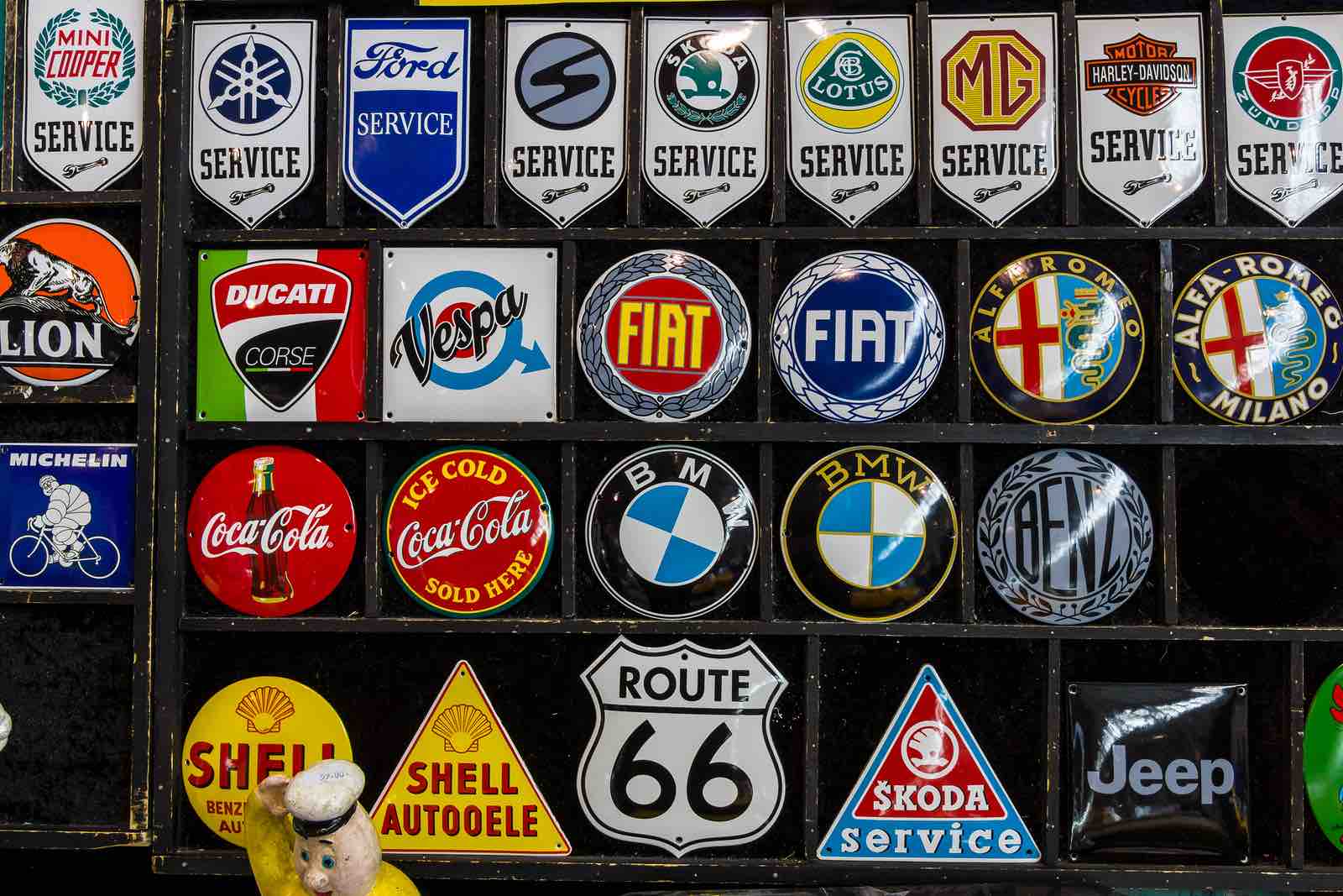
This is a question that is presented pretty often by entrepreneurs and marketing teams of new businesses. Here is the truth of the matter: Logos CAN be important. Here are two other truths when it comes to logos: 1.) Businesses make too much of a logo; 2.) Businesses don’t make enough about a logo.
Those seem like contradictions, but we guarantee you that they are not. Those latter two statements are what the initial statement is all about: logos CAN be important.
REASONS WHY THE LOGO CAN BE IMPORTANT
If you own a business or are in the marketing team of your company, then you may already know a few of the reasons why logos are important to a business. Here are some of the reasons we definitely know why they are important:
- SYMBOLISM: It is the symbol of your business. When people see it, they picture your company.
- REPRESENTATION: Just like any employee, you want your business represented a certain way. A logo helps do that.
- BUILDING BLOCK: Whether you like it or not, your logo is part of the building block of your company.
You may think these three reasons do not provide enough information about what a logo does. Well, keep reading. That’s what this next section is for.
MAKING TOO MUCH OR NOT ENOUGH ABOUT A LOGO
Symbolism. Representation. Building Block. These three tie in together whether you make too much or not enough about your logo. So let’s tackle these both individually.
TOO MUCH
A logo is a symbol of your company. It will go on everything and will be seen everywhere your business is represented. Uniforms, vehicles (if your industry requires it), signage, business cards, website, social media, etc. It needs to be clean and represent your industry in a way that makes sense. The logo needs to be something you and your employees are proud of as well. It should never be, “Well, I know our logo is horrible, but we’re good at everything else.” Many times, your logo is the first impression for customers.
In this regard, business owners and marketing teams can make too much of a logo. It doesn’t have to be perfect. Just about every logo that has stood the test of time has not resisted the test of time. There are continual updates and slight changes to the logo (i.e. Starbucks, Coca-Cola, Macy’s, etc.). A logo should never keep a business from opening its door all because it isn’t “perfect” enough. Decide on the elements for the logo (color scheme, symbols, font, etc.) and then put the logo together. The logo should be the symbol of your company’s success, not the symbol of a ball and chain.
NOT MAKING ENOUGH
On the opposite side of the coin is the company or marketing team that doesn’t make enough about the logo. It is thrown together without much forethought and absolutely no afterthought. There are some logos that try to say too much. A clutter of symbols, colors, and letters. The message, of whatever they are trying to tell, is lost on the consumer. Then there are logos that simply don’t say anything at all. Just a symbol and a random color combo that means absolutely nothing.
Logos should play off of the industry (i.e. Ozarka, Burger King, Lowe’s), the name of the business (i.e. Domino’s, John Deere, Target), or should just display the name (i.e. Ford, Hilton, Wendy’s). As we mentioned above, choose your colors, your font, and your symbols (if any), and go from there.
In other words, don’t make too much of the logo that it holds you back from initiating production, but also make enough about it that it doesn’t hold you back from encountering production. Because remember, logos CAN be important.


